In this article let us understand the Bar & Column Charts in Power BI visualization.
One of the most common ways of visualizing the data is through Bar & Column Charts. In this type of chart, the visuals contain a rectangular bar. The length of the bar is proportionate to the data values.
Data Analytics Tricks in Power BI – Guidebook
You too can analyze data like a Data Scientist. No coding needed. No statistics needed.
Analyze & Visualize data using Power BI. (23 tricks in one book)
Power BI Visualization with Bars & Column Charts
Bar or Column charts help you to compare different trends or track changes with respect to time. If the functionality of the bar & column chart is the same then what is the difference between the two? The answer is in its representation;
If the rectangles are placed horizontally then they are called Bar Charts.
If the rectangles are placed vertically then they are called Column Charts.
You learned the difference between Bar & Column chart but do you know the difference between Power BI & Tableau?
Steps to Create Bar & Column Chart in Power BI
There are two ways to create Bar & Column Chart in Power BI.
The first method is as follows:
Step 1: To create a column chart automatically, drag and drop the sales from fields to the dashboard.
Step 2: We can add the states field in the axis section so that it represents the sales state-wise.
Step 3: If you want to convert the same chart into a column chart, we can click on Bar Chart from the Visualization Pane and convert it into a column chart.
The second method is as follows:
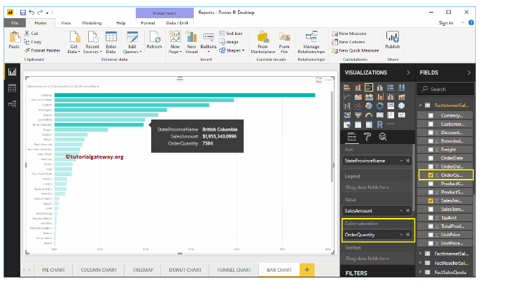
Step 1: From the Visualization pane click on Clustered Bar Chart. Automatically a bar chart will be created with dummy values.
Step 2: Now by adding the values to the axis, we get the actual Bar chart. The values of the sales can be specified on the column to represent the horizontal bars.
Step 3: Now add the states to provide state-wise sales value by simple drag and drop on the axis section or by clicking on the checkbox of the State column.
Step 4: By the use of color saturation property, the color of the bars will change according to its values. Increase in sales represents the dark color shade of the bar chart and vice-versa.
You learned the steps to create the Bar & Column Charts in Power BI, let us know more tips and tricks in Power BI.
Data Analytics Tricks in Power BI – Guidebook
You too can analyze data like a Data Scientist. No coding needed. No statistics needed.
Analyze & Visualize data using Power BI. (23 tricks in one book)
Formatting
The option of formatting a bar chart is also available. By clicking on format bar chart option, you can format Bar Chart Title, bar colors, Data color, background colors, Axis font and colors, and much more.
Interested in formatting the visuals? You might also find it interesting the usage of DAX in Power BI.
Clustered Bar & Column Charts
If we need to compare two values side by side the clustered Charts come in use. For example, it happens that we need to compare the sales values of two years month-wise, with the help of clustered Bar chart the sales of the previous year will be represented in light color shade and the sales of the current year are represented by the dark shade of the color. Thus, by comparing side by side sales of two years month wise it is easy to draw conclusions.
Thus, we got to know the insights of the Bar & Column chart and even learned the two-process involved to create the same in Power BI. Formatting tools can also be used to format these charts accordingly.
Data Analytics Tricks in Power BI – Guidebook
You too can analyze data like a Data Scientist. No coding needed. No statistics needed.
Analyze & Visualize data using Power BI. (23 tricks in one book)