In case, if you plan to use the Histogram tool, you need to keep in mind and you have to make sure that the Analysis Tool Pak Add-in is installed on your system.
Excel Vlookup formula – Guidebook
Bored of downloading text heavy / copy-pasted eBooks?
If Yes, you will enjoy this guidebook on ‘Excel Vlookup Formulas’ – VLOOKUP, HLOOKUP, MATCH & INDEX.
Using the Histogram in Excel
If you’re planning to use the Histogram tool, then there are certain things that you need to keep in mind. You got to ensure a point that the Analysis Tool Pak Add-in is installed in your system. The most important steps:
Steps to Install histogram in Excel
In order to create a histogram in Excel, you need to start with the installation Process. First, start with installing of the Analysis Toolpak add-in. This Toolpak add-in will enable you to create the histogram quickly. This happens when you take the data and the data range (bins) as the inputs.
Installation of Histogram in Excel using Data Analysis Toolpak add-in:
- Click on the File tab and then select the ‘Options‘.

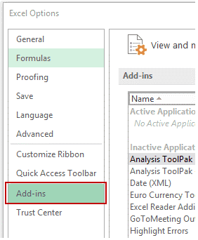
- Excel Options dialog box, select the Add-ins from the navigation pane.
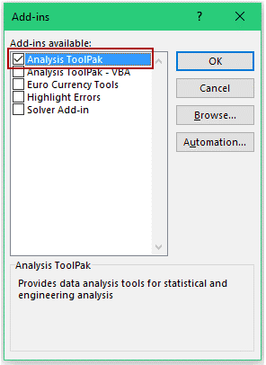
- In the Add-ins dialog box, you have to select Analysis Toolpak and then click OK

15 Excel Data Cleaning Tricks Guidebook
Bored of downloading text heavy / copy-pasted eBooks? If Yes, you will enjoy this guidebook (43 pages)
- This will help you install the Analysis Toolpak. And then you can easily have the access to it in the Data tab of the Analysis group.
Now, How to create histogram in Excel by using Data Analysis Toolpak
Once you have the access to the Analysis Toolpak enabled, you can use it for creating a histogram in Excel.
Suppose you have got a dataset which is shown in the below image. It contains the marks. i.e. (out of 100) of the 40 students in a subject.

In order to create a histogram while using this data, we need to create the data intervals from where we would obtain the Data. The place from where you would want to find the data frequency. These are called the bins.
With the above dataset, the bins can be termed as the marks intervals.
- You will need to specify these bins separately in an additional column which is shown below:

Excel Vlookup formula – Guidebook

Bored of downloading text heavy / copy-pasted eBooks?
If Yes, you will enjoy this guidebook on ‘Excel Vlookup Formulas’ – VLOOKUP, HLOOKUP, MATCH & INDEX.
Now that we gathered all the data in the place, let’s see how we can successfully create a histogram using this data:
- Visit the Data –> Go to Analysis –> Go to Data Analysis.

- In the Data Analysis dialog box, select the Histogram in Excel from the list.
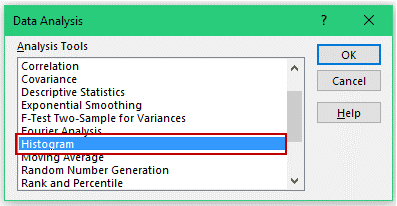
- Click OK.
- When in the Histogram dialog box:
- Firstly, you’ve to select the Input Range (i.e. all the marks in our example)
- Then select the Bin Range (cells D2:D7)
- Leave the Labels checkbox unchecked (and you’ll need to check it only if it is including the labels in the data selection).
- You need to Specify the Output Range in case if you wish to get the Histogram in the same Worksheet. Or else, you even get and can select the option for New Worksheet/Workbook, if you want to get it in a separate worksheet/workbook.
- Select Chart Output.
Create a Histogram Chart using Excel’s Analysis ToolPak Add-in
With Excel ToolPak Add-in you can create Histogram Chart as follows,
Step 1: In Data Tab Excel, in the Analysis Group, Click on Data Analysis Button
Step 2: In Data Analysis Dialog, Click on Histogram and Click OK.
Step 3: In the Histogram Dialog window, do the following thing,
- Specify input Range & Bin Range
- Select Output Options
Step 4: Now Click OK. & you will get Histogram in Excel with Add-In
You can analyze your information i.e. the Data and then later show it in a histogram bar chart. This is a column chart that displays frequency data by utilizing this Histogram the bar chart tool which is actually the Analysis Tool-Pak used in MS Office Excel. In order to make a Histogram bar chart, you would need to organize the info which is basically the data individually in two columns on the worksheet. These columns should be containing the input data and the bin numbers.
The input information or input file, computer file or the input data} is the data that you wish to investigate or Analyze by utilizing or making use of the Histogram tool. Bin numbers are called to be or considered to be the numbers that represent the intervals that you have always wished for your Histogram chart tool to use for the measurement of the {input information, input file and input Data} within the data analysis.
While you’re using the Histogram tool, Excel may count the quantity of information the number of Data points in each & every data bin. Now, this Knowledge/information point or the Data Point is enclosed in an exceedingly explicit data bin if the quantity is bigger, the number is greater than that of the lowest bound and further equal to or less than that of the Largest bound maintained for the Data Bin.
If you plan to omit the bin range, then here Excel will be creating a collection of equally distributed bins between the minimum and most of the Maximum values of the input data.
The output of the histogram which is taken, it’s analysis gets displayed on a complete new worksheet (or this could be called a new workbook) and shows that a histogram table and a column chart that reflects the data in the histogram table.
15 Pivot Tables Tricks for Pros
15 Pivot Table tricks to make your Excel data analysis smarter! 5,600+ downloads.
Most Popular Tricks are #3, #7 & #12

