Imagine you have a result sheet for your students over the last 5 years and want to create a chart in Excel, which takes time. In that case, you are thinking if only there were some small mini-charts in a single cell. Well here is the solution.
Ever had a worksheet of data in Excel and quickly wanted to see the trend in the data? Sparklines are an excellent way to show in a small space the trends or variations in a large volume of data. Excel 2010, 2013 and 2016 have a cool feature called sparklines that basically lets you create sparklines i.e. mini-charts inside a single Excel cell called ‘Sparklines’. You can add sparklines to any cell and keep it right next to your data. In this way, you can quickly visualize data on a row by row basis.
Excel Vlookup formula – Guidebook
Bored of downloading text heavy / copy-pasted eBooks?
If Yes, you will enjoy this guidebook on ‘Excel Vlookup Formulas’ – VLOOKUP, HLOOKUP, MATCH & INDEX.
What are sparklines?
Unlike charts on an Excel worksheet, sparklines are not objects — a sparkline is actually a tiny chart in the background of a cell.
Why use sparklines?
Data presented in a row or column is useful, but patterns can be hard to spot at a glance. The context for these numbers can be provided by inserting sparklines next to the data. Taking up a small area, a sparkline can display a trend based on adjacent data in a clear graphical representation. You can quickly see the relationship between a sparkline and its underlying data, even when your data changes you can see the respective changes in the sparkline immediately.
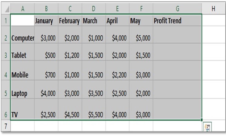
Case Study: In this example, we will use a database of an electronics shop that contains profits from each product for the last 5 months. We want to see the trend of profit of the particular product beside it. How can we do this?
Answer: Using Sparklines!
How to Create Sparklines in Excel
Here are the steps to insert a line sparkline in Excel
1. Create a table in an excel sheet
2. Click on the cell G2 in which you want the sparkline and go to Insert tab.
3. In the Sparklines Group click on ‘Line’.
4. ‘Create Sparklines‘ Dialog box appears.
5. Now in Data Range select range B2: F2 from row
6. Now click OK & you will get Sparklines in excel
Now we will get the sparkline showing the trend of the values included in row 2 as shown above.
Do Step 2 to Step 5 again for the rows 3-6. Then our table will look like the image above.
15Excel Data Cleaning Tricks Guidebook
Bored of downloading text heavy / copy-pasted eBooks? If Yes, you will enjoy this guidebook (43 pages)
Tips on How to create sparklines for the rest of the rows
Tip 1: There is another shortcut way to create sparklines for the rest of the rows
Select Cell G2, then Click on the lower right little pointer of the selection and drag it below to cell G6. You will get the same result!
Tip 2: Change the style of Sparklines
Select sparklines and go to the Design tab. After selecting, the Design tab will show a lot of options to add markers inside sparklines based on your requirements like High point, Low point, etc. You can also choose a Design and Color for sparkline from the design tab. With these, there are some other features like Axis, Edit data, marker color and so on. You can use them as per your requirements.
15 Pivot Tables Tricks for Pros
15 Pivot Table tricks to make your Excel data analysis smarter! 5,600+ downloads.


Please do highlight the steps . Otherwise it is explained properly with the help of images.