In this blog, learn how to make a scatter plot in excel and you will able to make excel scatter plots at the end of the blog. Choosing the right type of chart or graph can be key to convey the most important insights into your data—on sight.

When do you want to dig a little deeper into some data, but not quite sure how – or if – different pieces of information relate?
Scatter plots are an effective way to give you a sense of trends, concentrations, and outliers that will direct you to where you want to focus your investigation efforts further.
Excel Vlookup formula – Guidebook

Bored of downloading text heavy / copy-pasted eBooks?
If Yes, you will enjoy this guidebook on ‘Excel Vlookup Formulas’ – VLOOKUP, HLOOKUP, MATCH & INDEX.
Scatter Plot is one of the most interesting and useful forms of data analysis.
A scatter diagram (also known as a scatter plot) is a graphical representation of the relationship between two variables. It helps us visualize the apparent relationship between two variables that are plotted in pairs
When to Use a Scatter Diagram in Excel?
Investigating the relationship between different variables.
Examples: Male versus the female likelihood of having lung cancer at different ages, shipping costs of different product categories to different regions, etc.

A scatter chart plots the values for two variables as a set of points on a graph.
One variable controls the position on the x-axis of a point, while the other variable controls the position on the y-axis. Let us see the example
Case Study
To find the relation between the number of years people spend in education and their salaries.
When we look at the raw data it is hard to find what’s going on, so we will use them to create a scatter chart.

How to Make a Scatter Plot in Excel
To create or make Scatter Plots in Excel you have to follow below step by step process,
- Select all the cells that contain data
- Click on the Insert tab
- Look for Charts group
- Under Chart group, you will find Scatter (X, Y) Chart

5. Click the arrow to see the different types of scattering and bubble charts

6. You can pause the pointer on the icons to see the preview in your document
7. Click on Scatter Chart

Excel Vlookup formula – Guidebook

Bored of downloading text heavy / copy-pasted eBooks?
If Yes, you will enjoy this guidebook on ‘Excel Vlookup Formulas’ – VLOOKUP, HLOOKUP, MATCH & INDEX.
8. On Clicking, you will see the scatter chart.

9. You can quickly edit the chart by clicking the icons available on the right side of the chart
We can make this relationship, even more, clearer by using trend lines.

Using Trendlines In Scatter Charts in Excel
Trend lines mark out the trend in the data.
To display a trend line in our scatter chart
1. Select the Chart
The moment you select the chart, Design and Format tab appears

2. Go to Design
3. Look for “Add Chart Element”
4. Click on the drop-down and you will see various types of elements which you can add to a chart

5. Look for Trendline
6. Click on the drop-down of Trendline
Various trend line options are available. You can hover the mouse over it to see a preview in the chart
7. I will click on the Linear option
On Clicking, the trend line has appeared in the chart.
This Trendline helps us understand the data better, but we can also add more useful information.
It represents a linear equation and we can make that equation displayed on the chart, if we wish to.

With the chart selected,
8. Click on the trend button again
9. Go to Design
10. Click on “Add Chart element”
11. Now, Click on “Trendline”
12. Then, Click on “More trendline options”

13. Click on ‘More trend line options’, you will see ‘Format trendline” on the right side of your excel.

14. Scroll this down to see “Display equation on the chart”

15. Click on “Display equation on chart”
16. On Clicking, an equation is showed on the chart.
Conclusion: You must have learned how to create a scatter plot in excel, by given example.
So, that was the Excel Scatter Plot. Hope you liked it. Don’t forget to comment on your take on Scatter Plot.
15 Pivot Tables Tricks for Pros
15 Pivot Table tricks to make your Excel data analysis smarter! 5,600+ downloads.
Most Popular Tricks are #3, #7 & #12
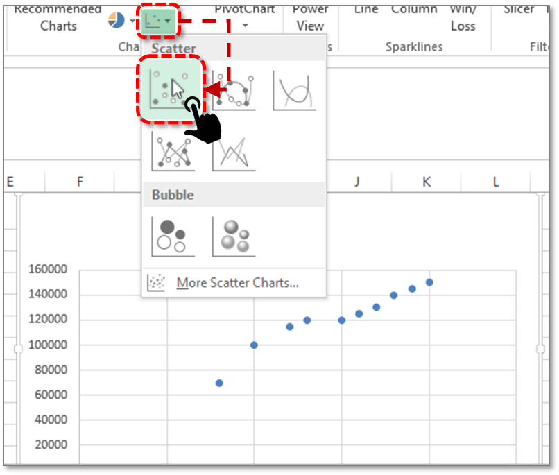
It is helpful. Can you tell me how can i highlight data in the Scatter chart ?