How to add Error Bars in Excel: Standard Deviation? Imagine that if all data was perfect, absolute and complete. Although actually, it isn’t, Excel gives us some useful tools to convey margins of error and standard deviations. If you work in a field that needs to reflect an accurate range of data error, you can add Error Bars to your charts and graphs.
Excel Vlookup formula – Guidebook

Bored of downloading text heavy / copy-pasted eBooks?
If Yes, you will enjoy this guidebook on ‘Excel Vlookup Formulas’ – VLOOKUP, HLOOKUP, MATCH & INDEX.
Let’s see how to add error bars in Excel?

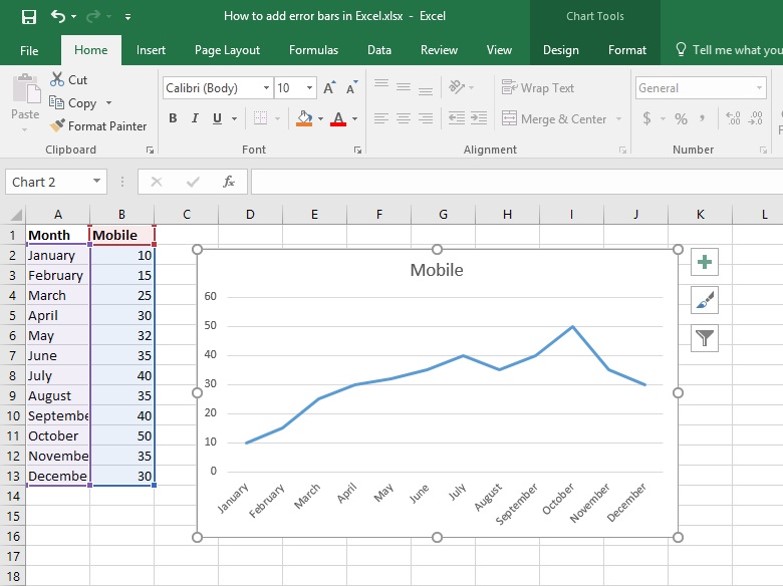
Adding error bars in excel with this example, we have a linear graph which is showing the monthly sale of the mobile product of the shop.
How to add a standard bar in Excel or Standard Deviation?
Step 1: Click on the Chart.

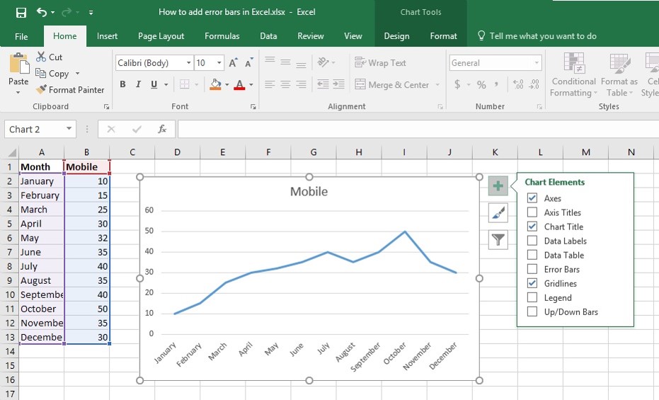
Step 2: Click the Chart Elements Button to open the fly-out list of checkboxes.

Step 3: Put a check in the Error Bars checkbox. Then the graph will be looked like above picture.

Step 4: Click the arrow beside the Error Bars checkbox to choose from common error types. There are 3 types of Error:
- Standard Error: To display standard error amount for all values.
- Percentage: To specify a percentage error range and Excel will calculate the error amount for each value. Default percentage is 5%.
- Standard Deviation: To display standard deviation error amount for all values. Resulting X &Y error bars will be the same size and won’t vary with each value.

Excel Vlookup formula – Guidebook

Bored of downloading text heavy / copy-pasted eBooks?
If Yes, you will enjoy this guidebook on ‘Excel Vlookup Formulas’ – VLOOKUP, HLOOKUP, MATCH & INDEX.
Excel uses the above equation to calculate Standard Deviation Amount.
Here, s = series number I = point number in series s m = number of series for point y in the chart n = number of points in each series y is = data value of series s and i the point n y = total number of data values in all series M = arithmetic mean

Step 5: Click Standard Deviation Error from the Error list of Error bars. Now our graph will be looked like above picture.
So We have added error bar with Standard Deviation in our linear graph! Now let’s get some Tips!

Tips 1: We can also turn on Error bars from the Add Chart Element drop-down button on the Design tab under the Chart Tools contextual tab.

Tips 2: Customize Error Bar Settings
Double click on any Error Bar inside the graph. It will open the Format Error Bars Task Pane with many options to customize Error Bar. You can Change the color, Direction, End Style and much more. So, Now we have learned about how to add Error Bars with Standard Deviation in Graph with some tips!
The direction of the error bars depends on the type of chart you’re using. Scatter charts can show both horizontal and vertical error bars. You can remove either of these error bars by selecting them, and then be pressing Delete.
The ease with which our tutorials provide students with all the necessary information enables our students to efficiently and effectively get the most out of Excel, the world’s most popular software for any kind of business.
15 Pivot Tables Tricks for Pros
15 Pivot Table tricks to make your Excel data analysis smarter! 5,600+ downloads.
Most Popular Tricks are #3, #7 & #12

